Blackberrys Just Don't Do

I just saw the new Blackberry advertising campaign, "there are people who do, and people that don't". This subject makes me very touchy indeed. Having come from the kind of school that slaves drives the minds of the people that are capable of straight A*'s into going to the top universities for the peak of accademia, while the 'creative' people sit on the sidelines and clap when their told to. Not only is this stupid because the genius in the minds of the academics can be applied to creativity with enlightening results, but they can co-exist in the same person. Creativity can be applied to anything, and its that kind of creativity that scientists come up with cures for diseases, or designers people come up with inventions that save the world. 


The people that 'do' in this world are not defined by what grades they get, or how much money they make each year. Anyone can 'do', regardless of... well everything.  And whats more, is that the people who do 'do' dont usually own Blackberrys. The probably dont even own a phone. They are too busy out there doing. Exploring the world, seeing their friends, living life.


 From my experience the people who own Blackberrys are mainly business men, working for massive companies, taking orders on the daily and following them because its their job to. Theres nothing wrong with that, because that is what they do best. Phones are made for communicating, and Blackberrys do that very well. It just annoys me how oxymoronic their advertising is. The people who 'do' are the people who do what their told. BUY A BLACKBERRY! THINK FOR YOURSELF! These two things don't go together. Neither do Blackberrys and creative people. People who do.


Revision

Project 3 Revised: Rulebook: X-Height Part 2
(Ben Pender, Anastasija Voitova)

A revised version of our earlier X-Height project for re-mark. We changed the final image to have small legs, which involved re-shooting all the images. This defiantly works a lot better than it did before, but otherwise the concept is still exactly the same.


Avengers Assemble

So, I saw the new 'Avengers Assemble' movie yesterday, which was FUCKING EPIC! and just when I didn't think it could get any better, I found these online... After reading they were priced at $600 for the lot, I was deeply upset. After some serious research online I found that there are a dozen ebay sellers parting with original copies for just under $50 a pop!  Definitely buying... possibly all of them. The hardest part now is deciding which one to get. If I were to be an Avenger, i'd probably be Thor... mainly cos of the hair and not the extraordinary amount of muscular tonage.


ABSTRUSE II

Project 14: Fanzine part II
(Group Project: Ben Pender, Olivia Charlesworth)

So after a few long discussions about how and where we went wrong the first time, we ignored everything we had been told and re-designed our Zine, almost completely. This time we stayed far truer to our original concept and to the essence of what a Zine is. The cost to make each Zine was re-thought as we realised that we had to make at least 30 of them in a week. This meant sticking to black and white printing at the uni printers/photocopiers. Still desperate to have colour we used a single colour setting for the back (red) and bound it with red ribbon. 

The idea of our Zine is based on abstraction; the reduction of information to a simpler form. We start with a theme, and break that down into 16 parts, one for each page. Each part is a clue to what the theme is. However each part has only a visual, cryptic clue for you to work it out. Without knowing the theme for which each page is bound, little can be understood about the editorial content of the Zine. Hence the name 'Abstruse' meaning difficult to understand. After you've read through the minefield of pages you are instructed to undo the 8 bindings on the spine and read the book in reverse. The back holds the red pages each of which has not only the answer but an explanation to how and why the clue was made as it was. Followed by some information about the answer itself. After that, the unusually made book can be folded out re reveal a poster with a visual representation of the overall theme. 

This Zine is part game, part informative guide, part poster. For just £3 this Zine can be yours, just email me at pender91@gmail.com for more information.


How To inspire creativity

I woke up this morning to this. A lecture by one of the of the most genius comedic writers of all time on creativity and how it is inspired. The points made are some of the most enlightening I've ever heard of the subject. It changed completely my perspective and the way I think. Don't be put off by its length, it is so worth your time. Plus there are some classic 'knock knock' jokes dispersed throughout that will have you on the floor.. sort of.

Do It Yourself

Project 13: Self Initiated II
(Group Project: Ben Pender, Tom Shearing)

For this self initiated we had the opportunity to work in pairs. We chose the theme of DIY as something we had in common, which the initial intention of using the time to make lots of things we could use for own homes. Realising our project probably needed more depth we set about finding the essence of what makes something 'DIY'. After spending hours making Lego and Airfix planes we came to the conclusion that what makes DIY is entirely in the process. Until you explain to someone that you made something yourself, it might as well be shop bought. No matter how good or bad you are able to make something, at the end of the day it is still a DIY project.

So we set out on a mission to make something that was almost entirely process, where the end result doesn't matter... So we spent 10 hours inside a small box, drawing ideas on A4 paper then disposing of them as soon as we finished. Using the recognisable gesture of scrunching up ideas on paper and discarding them into balls as soon as we finished. The gradual build-up of paper represents the eternal nature of making. The point something is past the stage of creation it is superfluous, and the care and attention it had is never felt for it again. The ruthlessness of this process is something we tried to capture, and by us continuing even when it has engulfed us exaggerates our ignorance of past ideas.


ABSTRUSE

Project 14: Fanzine part 1
(Group Project: Ben Pender, Olivia Charlesworth)

This week we were assigned a brief to publish our own 'Zine' under the broad title of 'elements'. On the second day (without having done any productive work yet) we had a tutorial to further advance our ideas. In scrambling our brains searching for an idea, we managed to fabricate a body of research in or minds for a rather complex Zine idea, based on the abstraction of information. Even using the mannerist definition of humour 'expectation deceived' to describe the way our Zine would be read... We had unaware-idly set ourselves an enormous task of creating what we blagged. After a nightmare week on InDesign, we had to come up with a document explaining the layout, grids, typefaces, every possible detail, amounting to the an overall 'attitude'. Almost every group failed this... including us. This is what we showed.


Wonga.com

Project 12: Abused
(Group Project: Ben Pender, Lizzie Reed, Chiara Bianchini)

This weeks project was focusing on the abuse of the corporate and social responsibilities that people have over others. We decided to direct our attention to the loan company 'Wonga.com' who only just operate within the boundaries of the law, providing money just like loan sharks, charging extortionate rates on the money they give out. Their advertising is directed at people needing a quick fix of money due to an unfortunate financial situation they are in. Without bothering to check whether or not their costumers are in any way able to pay back the money, they force their customers into further debt, in the hope they will have to borrow more money. This starts a downward cycle of financial troubles, which are rarely avoidable. It's disgraceful really... but it just makes for a better project. 

We wanted to give people the same feeling of excitement at the prospect of a deal too good to be true, quickly followed by the dread of knowing you are in a far worse position than you were before the deal. We presented ourselves as representatives of Wonga.com, with big smiling faces talking about all the 'good things' we do at Wonga. We handed out sweets to everyone in the audience to enjoy while we continued talking. Things soon took a more serious turn as we finally asked if anyone had read the small print before eating their sweets. The reply was expectantly 'no'. As we directed peoples eyes to the almost invisible small print on the board reading "*Wonga.com sweets may contain laxatives" peoples faces dropped. Anxious of the forthcoming bowl movements, we reassured people that unlike Wonga, we had actually made our own toilet paper to clean up the shit they leave you with. As a further piece of communication we installed posters in the toilet cubicles that outlined the abusive nature Wonga.com and similar loan companies. 


Jednačina

Project 11: Moving Parts
(Group Project: Ben Pender, Charlie Sims, Maranda Dixon)

We were given the task of turning 'Jednačina' the Croatian word for (mathematic) 'equation' into a piece of kinetic type that explains its meaning through its actions. In mathematics, equation is simply the word to describe one statement being the same as another. For example 3+4=7. Seven can be written as 'three and four'. This is probably one of the least kinetic things I can think of... In order to display it we decided to show and equation made out of the cut-up letters of 'Jednačina'. Effectively showing that 'Jednačina' = Equation, without writing the word equation but showing one. Then to make it even more explicit, we split the word into two equal parts that rise and fall to reveal an equals sign, '='.
The sounds are made from calculator tapping and scribing notes, as you would expect to hear when working something out... yet apparently this still wasn't clear enough...


Body Armour

Project 10: Crash
(Week Project: 3D Design project exploring the possibilities of 'Crash')

'One obstacle colliding violently with another'. For this project I looked into the unique properties of High Impact Polystyrene (HIPS). After testing how well the material absorbs large quantities of energy, I decided to explore the potential of making this into some form of protective armour. Using only scraps of the blue material i had found in the workshop, i constructed a suit, keeping it together using only glue and tape. 
In the crit I gave a quick introduction into the material itself outlining its properties, before inviting volunteers to come up and punch me as hard as they could in the stomach. The force was almost completely absorbed by the suit and all I felt was an overall force that knocked me back a step. Feeling confident I stepped it up a notch, handing out metal sticks to people. This, while terrifying, actually had less impact than the punches. So then I invited out Josh Lake (one of the strongest guys in our year) to have a go with a 7.5lb sledge hammer. Insisting he didn't hit me hard enough, I egded him on to hit me harder. Apart from the fact he managed to hit me on the weakest point of the suit, at the top of my stomach, it knocked the wind out of me. I couldn't breath for a minute or so but after once I had recovered, I drew a knife and insisted someone plunge it into my chest... Thankfully I'm still alive!


Tangles


Project 9: Self Initiated I
(2 Week Project: Initiate a project of whatever interests you... or doesn't)

I set out to change the way that people perceived tangles. As a person that is obsessed with order and neatness (especially when it comes to electrical cables, that potentially cause an unsightly mess) I am constantly irritated by the knotted clump of wire that emerges from my pocket, as my headphones so frequently get tangled.  I posed the question ‘why do things get tangled?’.  I wanted to find a scientific reason for it, and perhaps try and prevent it from happening. 


I soon changed my tone and wanted tangles to be shown in a more positive light; one that reflects a distinction of classification through its function rather than the arbitrary perception of an individual.  By encompassing knots into the same bracket as its tangled cousins I tried to shift the balance of tangle being used as a negative word. There were now two main categories, purpose tangles and informal tangles.  Obviously a purpose tangle was something that had been knotted consciously and most often had a function or purpose. The informal tangle however was quite the opposite.

After developing this route for some time, I felt that it still gave a typical tangle an unfair deal. I started to think that it was actually the knots themselves where the cause of the frustration that comes from ‘tangles’.  The oxford dictionary describes tangles as “a confused mass of something twisted together”.  Nothing implies that it involves any knotting, but simple arbitrary twists and loops that creates only the illusion of a knot. If a tangle can exist independent of knotting it shouldn’t be to blame when deciphering the annual mess of Christmas lights or the daily struggle of the headphones.


Running the same idea of celebrating tangles, it was my goal to change people perceptions of what a tangle was and see it now as a positive rather than a negative thing. For example “oh good, my headphones are just tangled! For a second there I thought they might be knotted…” To do this I researched more into the differences between the two, in order to discover any key information in that would contrast each other further. This led me to Jones Polynomial, invented in 1984 by Vaughn Jones, a great mathematician. This polynomial is able to calculate the exact formula for any given knot. This sounded like a relatively easy task to do, and I was confident that I could start naming tangles based on their unique equation. This was until it took an oxford mathematician five hours to resolve the answer for the simplest possible knot you can make. 

This led me to a conclusion that even the simplest knot was far more complicated than even the most complex of tangles. No matter the size of the tangle the equation is always the same and the answer is always 1. For my final piece I still aim to complete my initial goal of getting people to no longer thing of tangles as a negative, but I will contrast it with the complexity of a knot. I will demonstrate that a knot is chaos, ordered and a tangle is ordered chaos, through my mathematical discoveries. Alongside physical demonstrations of this, I believe that I will enlighten people to wonders of tangles.


Kalamos

Project 5: Visual Thinking...Continued

This is a follow-up to an earlier project (check back to number 5 for more info). As promised, here is our final video to our visual thinking brief. Just to reiterate; we were told to research the reed pen and ink, and from this produce a video taking our medium back to its rudimentary form. The design of the reed pen hasn't changed in 5000 years. The Egyptians first used them then and you can buy them in shops now, pretty much identically. They are just so simple they do not need to be changed. We wanted to show its simplicity... and show just how dirty the Egyptians were... men just havn't changed either, have they...

InDesign 101

Project 8: Typefrog
(Day Project: Find a piece of Typographic Graphic Design and deconstruct/reconstruct)

I am an InDesign novice. Never used it up till now.  I also started 3 days behind most other people (which was my fault really) so I gave it my best shot. First is the piece of design I chose for the project (which I didn't do!) and the second is my deconstruction of the piece. There is so much bullshit I could say about my work about the reasonings for  everything I did, but I'll spare you. Neither of us wanna hear it really.


Hero

This guy is most definitely a hero.  Miguel Endaras drawing stills are red-DICK-ulous. He basically spent 210 hours his life being a printer. Over 3million dots in one A2 sheet. Maybe the biggest hero is the guy who kept count. This is probably one of the dopest things around right now.  I am extremely jealous.


Occupy Everything

I really like this illustration. It has the same brutality in line of the early 20th century poster designs for communist Russia.  Influenced heavily by the Art Deco style artists such as Alexander Rodchenko were trying to break the imagination free from the shackles of conformity.  Illustrator Alexandria Clotfelter has captured the struggle of the 99% against the Wall Street tyrants. The protests are against social and economic inequality, high unemployment, greed, as well as corruption, and the undue influence of corporations.


Upside-Down Portaits

Project 7: 'Out of Order'
(Group Project:  Ben Pender, Lottie Boniface)

We were given a week to do a photographic project on 'out of order'.  Our aim was to get people to question our photos as an out of order piece, and make it seem as if nothing was out of order, yet having something hugely out of order portrayed.  After spending some time taking double exposure images to manipulate a normal environment, we decided that it would be far stronger to actually manipulate something rather than fake it.  Anyway, we ended up with the task of photographing portraits of people, hanging fully upside down! Creating a make-shift studio in my bedroom was the easy part... getting perfect portraits of people while they hang from their legs on a clothes rail was definitely the hard part.  Luckily no one was injured while making this project, thanks to our safety team who were on standby. We would both like to pursue this project and try and take portraits of our entire year group.  Click on the image to enlarge.

Week 6: Absurd Museum

I remember seeing in a book of stupid signs once a sign on an otherwise blank wall proclaiming "this sign is only temporary".  Obviously this sign would have no function other than to warn people that at some point they sign would be taken down, but that is of course its only purpose making it s kind of paradox.  However looking back through the book from where I saw this, i couldn't find it... I wonder if I made it up? Either way I made one on Photoshop as my exhibit into the museum of the truly absurd...


Distractology!

Project 6: Ology Orgy

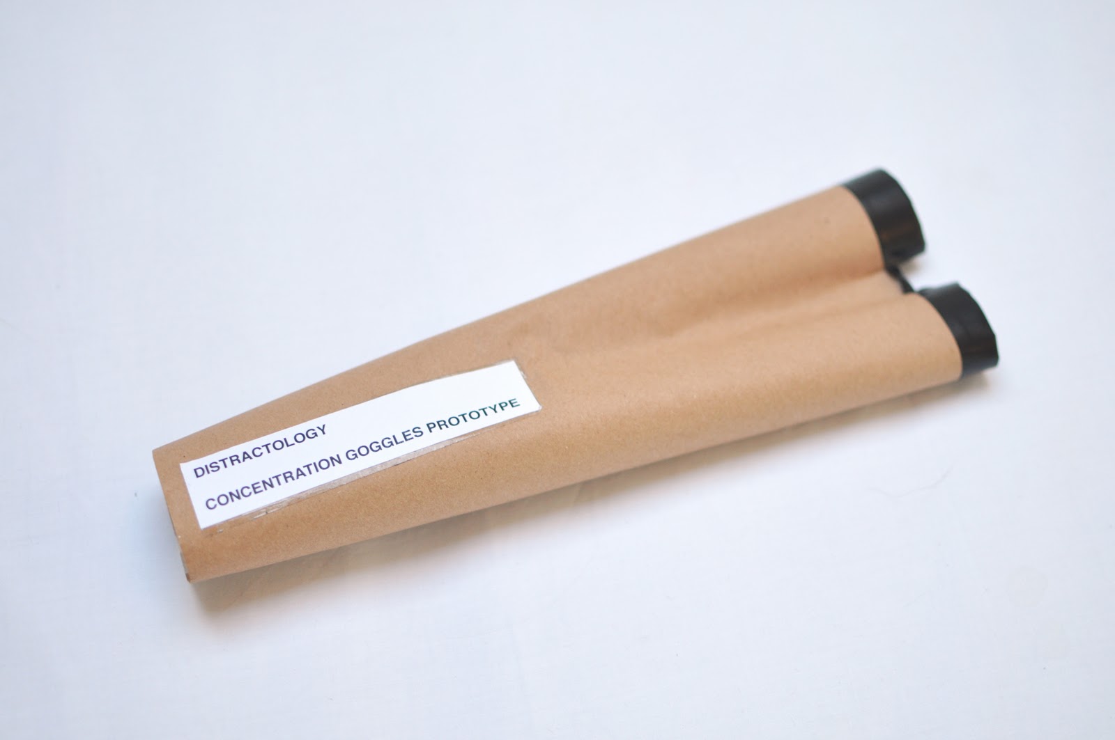
This week we were given the challenge to invent a new ology - the study of something. The idea was that we were all competing for our ology to become an official ology. We started out looking at 'Stareology', the study of staring, but after a day and a half of research our work was literally torn to shreds, and deemed too boring an ology to have a chance at winning. However we pushed slowly and begrudgingly forward from one idea to the next, with no real confidence in our ideas. At the end of the 3rd day we landed on distractions due to Lottie's observation of how easily us as a group got distracted by things.  With just one more day left we cycled through as many ideas as we could, trying not to be distracted by how well other groups appeared to be doing... 
On the evening of the last day we drastically changed our idea, stripping away almost everything we had planned to present, and decided... as Distractologists, that our goal was to eliminate distractions from the workplace.  In a sense our aim was to get people to focus more and concentrate despite distractions. So using an idea Scott had, we effectively designed a pair of blinkers for humans.  We called them state of the art Concentration Goggles... High tech equipment made from tubes of paper stuck together at a particular angle, designed to channel your vision into one small, circular area.

We asked people to wear these at all times throughout our crit, for experimental reasons, and at no time were you allowed to take them off. We designed some carefully planned distractions throughout our crit in order to see if there was an improvement in concentration levels despite the distractions. The results were positive as everyone missed Alice and I swapping clothes... There will be a video to follow shortly...


We made nice pairs for the tutors...
...and 50 'shitty' ones for the class
Our presentation was pretty minimal...
We also achieved full accreditation for our ology based on our presentation alone... yay!

Week 5: Food

This is a somewhat gross idea but it was one of the first things I thought of... I dunno what that says about me but I doubt its very healthy. I like to think the idea stemmed from a Futurama into I saw a while back. Imagine this guys voice narrating it... this guy.


Reed, Dick & Ink

Project 5: Visual Thinking

For this weeks project each group was given a different writing implement. We were given a Reed pen and a pot of Indian ink, with a whole week to research as much as we can into our chosen medium and come up with an idea for a minute long video that would show off our tool in its most rudimentary form.  In short we realised that the beauty of the Reed pen is that it hasn't changed in over 5000 years. It is itself its simplest form and could not be improved in design.  The other observation we made was; give 4 boys some pens and paper, no matter how fancy, and they'll end up drawing dicks and other profanities all over the page... Something that apparently we have in common with our 5000 year old ancestors... fancy that...