Jeff Jarvis

I found these type samples by Graphic Designer, Jeff Jarvis, living and working from Brooklyn. Something drew me to his subtle and selected use of colour, playfulness execution. 'Fizz' has and incredible double 'z' and against that faded black the text has context.  I'm sure it was his intention but I love the way 'there and back' makes your eyes travel forwards and backwards re-reading it while your eyes swivel in there sockets. 'Moving' is deliberately cropped to show movement in context, to show that it has moved. None of these things have any place in fonts but as concepts or as ways of demonstrating fonts they are lovely examples.


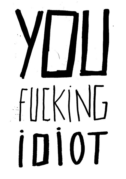
A Giant Fuck

This is a typographics piece I found on 'this isn't happiness' by Rita Gomes which I sort of like but can't explain why exactly.  I have always thought that it would be interesting if you could make a handwriting font for a computer that would generate letters slightly differently at random so as to make it more free-form, like regular handwriting where letters are not uniform.  This made me think of that, then it made me think of me being a fucking idiot...

Skin Type

While looking through 'ilovetypography.com' I discovered this really gross typeface by Thijs Verbeek entitled simply 'typeface in skin'.  He uses clothes pegs to pinch various sections of skin into letterforms. Looking through the entire collection I found myself wincing at each image trying to work out where on the body it must be.  For the entire alphabet click here.


Linotype

Here is a trailer for a feature-length documentary film made by Doug Wilson about the Linotype type casting machine. About a year ago he partnered up with two good friends on a journey to document the Linotype and the people who loved and still love these crazy machines. After 45 interviews and 26 separate shoots, they have amassed an amazing collection of footage telling the surprisingly emotional and fascinating story of the Linotype.

Typography

Got given this book about fonts for my Birthday. I think my knowledge of typography is embarressingly limited, compared to most people studying graphic design.  Over the last year I've realised that one would be wise to learn the phopa's of typographics before attempting to show their work. The first chapter is entitled "We don't serve your type", written in Comic Sans... Obviously a classic graphic design joke.  Seems like I got some reading up to do...