Kalamos

Project 5: Visual Thinking...Continued

This is a follow-up to an earlier project (check back to number 5 for more info). As promised, here is our final video to our visual thinking brief. Just to reiterate; we were told to research the reed pen and ink, and from this produce a video taking our medium back to its rudimentary form. The design of the reed pen hasn't changed in 5000 years. The Egyptians first used them then and you can buy them in shops now, pretty much identically. They are just so simple they do not need to be changed. We wanted to show its simplicity... and show just how dirty the Egyptians were... men just havn't changed either, have they...

InDesign 101

Project 8: Typefrog
(Day Project: Find a piece of Typographic Graphic Design and deconstruct/reconstruct)

I am an InDesign novice. Never used it up till now.  I also started 3 days behind most other people (which was my fault really) so I gave it my best shot. First is the piece of design I chose for the project (which I didn't do!) and the second is my deconstruction of the piece. There is so much bullshit I could say about my work about the reasonings for  everything I did, but I'll spare you. Neither of us wanna hear it really.


Hero

This guy is most definitely a hero.  Miguel Endaras drawing stills are red-DICK-ulous. He basically spent 210 hours his life being a printer. Over 3million dots in one A2 sheet. Maybe the biggest hero is the guy who kept count. This is probably one of the dopest things around right now.  I am extremely jealous.


Occupy Everything

I really like this illustration. It has the same brutality in line of the early 20th century poster designs for communist Russia.  Influenced heavily by the Art Deco style artists such as Alexander Rodchenko were trying to break the imagination free from the shackles of conformity.  Illustrator Alexandria Clotfelter has captured the struggle of the 99% against the Wall Street tyrants. The protests are against social and economic inequality, high unemployment, greed, as well as corruption, and the undue influence of corporations.


Upside-Down Portaits

Project 7: 'Out of Order'
(Group Project:  Ben Pender, Lottie Boniface)

We were given a week to do a photographic project on 'out of order'.  Our aim was to get people to question our photos as an out of order piece, and make it seem as if nothing was out of order, yet having something hugely out of order portrayed.  After spending some time taking double exposure images to manipulate a normal environment, we decided that it would be far stronger to actually manipulate something rather than fake it.  Anyway, we ended up with the task of photographing portraits of people, hanging fully upside down! Creating a make-shift studio in my bedroom was the easy part... getting perfect portraits of people while they hang from their legs on a clothes rail was definitely the hard part.  Luckily no one was injured while making this project, thanks to our safety team who were on standby. We would both like to pursue this project and try and take portraits of our entire year group.  Click on the image to enlarge.

Week 6: Absurd Museum

I remember seeing in a book of stupid signs once a sign on an otherwise blank wall proclaiming "this sign is only temporary".  Obviously this sign would have no function other than to warn people that at some point they sign would be taken down, but that is of course its only purpose making it s kind of paradox.  However looking back through the book from where I saw this, i couldn't find it... I wonder if I made it up? Either way I made one on Photoshop as my exhibit into the museum of the truly absurd...


Distractology!

Project 6: Ology Orgy

This week we were given the challenge to invent a new ology - the study of something. The idea was that we were all competing for our ology to become an official ology. We started out looking at 'Stareology', the study of staring, but after a day and a half of research our work was literally torn to shreds, and deemed too boring an ology to have a chance at winning. However we pushed slowly and begrudgingly forward from one idea to the next, with no real confidence in our ideas. At the end of the 3rd day we landed on distractions due to Lottie's observation of how easily us as a group got distracted by things.  With just one more day left we cycled through as many ideas as we could, trying not to be distracted by how well other groups appeared to be doing... 
On the evening of the last day we drastically changed our idea, stripping away almost everything we had planned to present, and decided... as Distractologists, that our goal was to eliminate distractions from the workplace.  In a sense our aim was to get people to focus more and concentrate despite distractions. So using an idea Scott had, we effectively designed a pair of blinkers for humans.  We called them state of the art Concentration Goggles... High tech equipment made from tubes of paper stuck together at a particular angle, designed to channel your vision into one small, circular area.

We asked people to wear these at all times throughout our crit, for experimental reasons, and at no time were you allowed to take them off. We designed some carefully planned distractions throughout our crit in order to see if there was an improvement in concentration levels despite the distractions. The results were positive as everyone missed Alice and I swapping clothes... There will be a video to follow shortly...


We made nice pairs for the tutors...
...and 50 'shitty' ones for the class
Our presentation was pretty minimal...
We also achieved full accreditation for our ology based on our presentation alone... yay!

Week 5: Food

This is a somewhat gross idea but it was one of the first things I thought of... I dunno what that says about me but I doubt its very healthy. I like to think the idea stemmed from a Futurama into I saw a while back. Imagine this guys voice narrating it... this guy.


Reed, Dick & Ink

Project 5: Visual Thinking

For this weeks project each group was given a different writing implement. We were given a Reed pen and a pot of Indian ink, with a whole week to research as much as we can into our chosen medium and come up with an idea for a minute long video that would show off our tool in its most rudimentary form.  In short we realised that the beauty of the Reed pen is that it hasn't changed in over 5000 years. It is itself its simplest form and could not be improved in design.  The other observation we made was; give 4 boys some pens and paper, no matter how fancy, and they'll end up drawing dicks and other profanities all over the page... Something that apparently we have in common with our 5000 year old ancestors... fancy that...


Week 4: Packaging

This week our idea was on packaging. My first thought was about packaging packaging. Despite thinking it was really obvious I thought more about it and applied it to a situation it which it may not be just a stupid comment.  So imagine your a 5 year old growing up in the 90's. Star Wars is still ever much the rage and all you want is some of the action figures to play with so you can make new movies in your mind while climbing and flying around the house. So when you get them of course you rip the packaging to shreds to free Han Solo from the plastic 'carbonite' that surrounds him... If I hadn't experienced the priceless memories of playing with these figures then I probably wouldn't be the man I am today... but I could be a lot richer had I kept the original packaging and sold the many copies I had of curtain figures to old fat men that get off on unopened packaging....


Typography 101

Project 3: The Rulebook
(Group Project: Anastasija Voitova, Ben Pender, Luke Evans, Rhosalyn Green)

Having not really done much typography of my own, I felt quite out of my depth with this project. We were given a rather complicated project in which we had to produce two final pieces under the same constraints;  B&W on A4 paper, with Georgia as our only usable typeface... Using this as our medium we were asked to describe the term 'X-height'. For all of you at home, 'X-height' is the height of a lowercase 'x' within any given font. It is used by typeface designers as a reference point to gauge the height of a letter from the baseline and the mean line. This needs to be considered when deciding the use for the typeface as it affects the readability and legibility at varying sizes... I hope that makes sense.  Anyway, the first resolution had to be a flawless example of purist typography, while the other was meant as a more creative use of the constraints provided.
 1.
For the first we decided to alter the 'x-height' of Georgia into the calculated 'x-height' of two other typefaces, Helvetica and Bernhard BT. By doing so we are showing that when the 'x-height' is not considered, small text becomes harder to read.  The right-hand text body is the height of the 'x' to the left to visually represent 'x-height' and the text sitting above and below the text body shows its relation to the cap height and descender height.
 2.
As for the second piece... we felt that we had thoroughly explained 'x-height' in the first part we decided to merely demonstrate it in a contextual situation. It extends directly to the body text of the first piece, where the top image shows Georgia with a traditionally perfect 'x-height', Helvetica with a beautifully simplistic style but an 'x-height' that favours style over function and Bernhard BT with a stupidly considered 'x-height'... nuf said.


Week 3: Unemployed

If you were metaphorically given a workforce of the 2.51 million unemployed people in the UK to put to good use what would you do?  I decided that it was good idea to try and create a band you could see from outta space.  Unfortunately sound cannot travel in space so the idea is impossible.  However the rest Europe might have to start wearing earplugs or alternatively pay good money for the experience.


Manipulation of Space

Project 2: Space
(4 day photographic project based on a personal view of space)

This week I looked into the manipulation of space. Space is usually within a given boundary or area with limitations. However these physical spaces can be altered depending on the individual perspectives of different people.
Through photography a particular perspective can be forced upon the viewer.  Removing references and considering obscure viewpoints on a particular space will hopefully provide an abstract view on space, which will not only be unique as an image but also to the individual.


So i did some modeling...

Yeah so I was asked to do some modeling for an MA Fashion student at Kingston.  Never done anything like it before. It was pretty jokes.  I dunno if I should do it again, but she asked me to do it again... for money... so I probably will...


This is not a Spleen

Project 1: Organs

Each Group was given a different organ, we were given the Spleen. We quickly realised that none of us new anything about a spleen. I thought it was just made up for cartoon violence. Subsequently we found out pretty much everything we could about the Spleen and decided it was quite an ambiguous organ. Despite it being very important, it is not vital, yet you could die without it... Anyway seeing as no one knew anything about the Spleen we decided to make up everything about it and make a presentation on how little the general public by lying straight faced to them, telling them what they didn't know was false.
So yes... this is not a Spleen... C'est Splean.


Week 1: Travel

JETPACKS! After having several ideas, I went back to my first idea, which wasn't even mine... Jetpacks. Probably not a great move considering the feedback I got was "whoever wrote that is a lazy thinker" perhaps a little harsh, but I admit I missed the point completely. However i stand by my point... who doesn't wanna look this awesome while traveling.


Tea break Challenge

The first day of many at Kingston Graphics. Spent the day meeting our tutors and getting to know our 88 strong group. We were instructed to play games involving meeting new people with opposite tastes to you, filling a booklet with phone numbers and choosing an ice-cream flavour that reflects us. On our break we were sent to have tea with 3 people you have only just met and take a photo. So here's me with 5 people minus the tea, which has been replaced with awkward hands in our laps.

Dining Table Project

This summer, my girlfriend Jocie (check out her awesome blog) and I decided to embark on a project together; to design and build our very own Dinning room table to go in our new house.  With all the excitement of buying a house, we got a little carried away/over ambitious, deciding it wouldn't take that long. We weren't following a recipe as such, just a vague plan Jocie sketched delicately on a piece of paper, including precise measurements on how to make a table look random yet considered. Here's how it went down. Step 1. Bought wood from B&Q 4x(200cm x 9.3cm x 1.5cm). Step 2. Cut it down to varying sizes based on the design. Step 3. Laid out the wood to check they fit together.  Step 4. Numbered each piece so we always knew where each went.  Step 5. (This was the fun bit) We distressed the wood using nails, screws, hammers, files, and many other sharp, blunt or heavy items to make each piece look like it had history. Step 6. We varnished the wood individually so they wouldn't quite match up. The vanish would thicken where we had distressed it, making it appear burnt or weathered but generally old and well used. Step 7. Was the longest step; each piece had to be doweled individually about 5 or 6 times to give it strength and support. Step 8. Using wood glue, a lot of clamps, and Jocie's Dad as backup, the table was bound and left to dry.  Step 9. The ends were planed flat then attached to the end pieces using ten dowels each side. Step 10. The legs were made from two B&Q fence posts that were cut in half and bracketted on using four 'L' Shaped brackets on each leg.

Despite vicious rumors that I built this table alone, it was very much a team effort. My part was simply brute manliness, and a love for playing with power tools... But as a great man once said... "it wouldn't be nothing, nothing, without a woman or a girl"

Here it is in action, in the new house. Since this photo it has been varnished, and the rest of the room looks a lot better than it does here. 


Tate Modern: Miró

Miró is a hero. I went to see the enormous collection of his works held on loan to the Tate. Since doing history of art and studying the surrealist movement, I've loved Joan Miró. Like many of his peers, the insanity in their work is their genius. I walked around the gallery listening to Mogwai which may have heightened my sense of awe, but yes I was in severe awe. There is a sheer diversity to his work that is like few others. The show is presented more or less chronologically, so as you continued the work became freer and freer, shape reduced to form reduced to line. From a different perspective I can see that it would look like he was just getting older and lazier with his work but I know this is far from true.  Yes he got older, continuing his work free from the conventions of the society he was brought up in. A sense of enlightenment that comes with age perhaps. He was and always will be insane... and I mean that in the best possible way.


BP Portriat Award 2011

I went to check out this years BP Portrait Award. As I walked into the exhibition I was greeted by a lifesize painting of two sisters by Tim Okamura called 'Little Sister'. What struck me about this painting was mostly to do with its process. Whilst still retaining realism it's very painterly; brush lines turn into drips further down and the hair is created through thick layering of paint.  Next to that was a very different style of painting (one that I could have sworn was a photograph) by Jan Mikulka called 'Jakub'. It was just so soft, I still don't know how people do it. However I think my favorites were Nathan Ford's 'Abi' - a very small and seemingly incomplete painting of a crazed man, whose eye lures you into the mess of smudged black paint and simple line; 'Holly' by Louis Smith - which depicts a young fiery haired woman chained to a rock (an allegory of the Prometheus story) held in an enormous 12 foot gold frame.  I do wonder how the award is judged, considering this years first prize winner... The painting wasn't at all bad, it just wasn't interesting. The depth to any meaning being it felt far too weak to have deserved £25,000.


Sistine Chapel - now Online

Found this while checking the Vatican Website. A 360 degree image of the Sistine Chapel! It's pretty detailed too, you can zoom right in and find some cool shit you couldn't see before. I went once, and it was a little overwhelming, then a little under. But all in all i think it was actually great. But its all the way in Rome? Not anymore... now you can go everyday!


Logorama

Logorama is a 16-minute long French animated film written and directed by François Alaux, Hervé de Crécy and Ludovic Houplain. The film depicts events in a stylized Los Angeles, and is told entirely through the use of more than 2,500 contemporary and historical logos and mascots. The film won the Prix Kodak at the 2009 Cannes Film Festival and the Academy Award for Best Animated Short Film at the Academy Awards. Oh and its pretty darn rootin' tootin'.


Photographer: Sean Vegezzi

Sean Vegezzi has been exploring the subways of New York since he was 12 years old, and has walked every line there is. He's only 21 years old, but his work already shows intellect and great talent. His photography documents explorations of a world of abandoned subway lines, hidden under Manhattan. The feeling that the subjects want to escape the city is strong and emotive. It's hard to tell if they are rejecting the city in which they live or trying to embrace a lost part of it, but there is definitely a sense of freedom in their actions. A rejection of culture and rules... outside the box thinking. I fear the world would be a very different place if people never questioned their surroundings, or the things they are told.


Jeff Jarvis

I found these type samples by Graphic Designer, Jeff Jarvis, living and working from Brooklyn. Something drew me to his subtle and selected use of colour, playfulness execution. 'Fizz' has and incredible double 'z' and against that faded black the text has context.  I'm sure it was his intention but I love the way 'there and back' makes your eyes travel forwards and backwards re-reading it while your eyes swivel in there sockets. 'Moving' is deliberately cropped to show movement in context, to show that it has moved. None of these things have any place in fonts but as concepts or as ways of demonstrating fonts they are lovely examples.


Back to the Future: Part 2

Hopefully you'll remember the awesomeness Now, I wasnt around in the 50's when Velcro was invented but that was designed to make putting shoes on easier right? Well back in 1989 Robert Zemeckis and Bob Gale prophesied a world where shoes no longer needed to be done up and lights on shoes also came in adult sizes.  Well 4 years ahead of schedule, Nike have decided to make 1,500 of these very shoes. They come equipped with the Back to the Future patented 'power-laces' and several different colored lights. So as long as you can pull these off, let alone afford them, I will forever worship you as some of the most bawler shit around.


Underwater

The feeling of being underwater is tranquil. I've always loved being submersed in it's embrace. Apparently I was meant to be born in water, but couldn't because I was being difficult. I learnt to swim at a young age; it was on a sailing holiday in Turkey that my parents threw me into the sea without arm bands in faith that I'd work it out. Which I did. The immense nature of the sea and what it represents makes for a very spiritual space. The sense of weightlessness makes you feel at one with it all yet so aware of your effect.  I have come across many a thought, many an idea, in the sea.


Troika

Although they aren't just one designer, I have to mention Troika as one of my favourites. Troika are Eva Rucki, Conny Freyer and Sebastien Noel, who are widely known for their experimental artworks. Their work is a combination of art, design, science and architecture. They produce work that's highly original based on surreal observations, scenarios and experiences, playing with sound, sight and movement in clever and innovative ways.


The Grand Canyon

Last year I spent two week traveling down through the Grand Canyon. As you look up to the top of the 6000ft cliff face above, you can't help but feel insignificant. Humbled by the mighty earth, I felt empowered to be so close to it. Having two weeks free from the distractions of technology, of noise, of time itself, you gain a lot of time with your thoughts. The sense of freedom is unparalleled. It's such a spiritual place.


Mountains

Mountain climbing/walking has been programed into me from a young age. When I was five I climbed Snowdon having done several climbs in the Lake District previously.  Once a year we usually go on holiday to some mountains and spend the week climbing and huddling in the cold evenings.  The process of walking is great facilitator of thoughts, and climbing a mountain is the ultimate experience of this. The journey has purpose and structure and to be at the top feels like enlightenment. I've had many thoughts whilst climbing many a mountain.


EasyWalker

Would somebody please explain this to me.. i just don't understand. Directed by David Lewandowski, an a computer animator who has worked on the likes of tron, his latest video is madness, but I kinda like it. Very curious to know how and why but I guess I'm never going to know...

One day i Plan to Top this

Sumo Science and Aardman have teamed up again to produce the worlds largest animation, as well as holding the title for the worlds smallest animation 'Dot'. The scale is just immense. I think in at least some of the shots the guy on the boat is a real person, which just shows you how epic the animation of the sand is, especially in the end bit.  Also i have to say that the underwater scene reminded me distinctly of 'A Town Called Panic' when they go underwater in search of treasure. Awesome movie by the way and y'all should watch it.


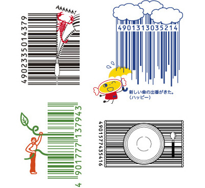
Big Ideas Are Small

There is a Barcode revolution happening people. The Japanese company 'D-Barcode' has taken it upon themselves to make barocdes a fun and enjoyable for all.  For some reason I had never questioned barcodes. I thought they were this thing that had to remain uncreased and untouched in order to be read by the magical infrared light wielded by seemingly untrained but somewhat mystical people. Now they just look jokes!

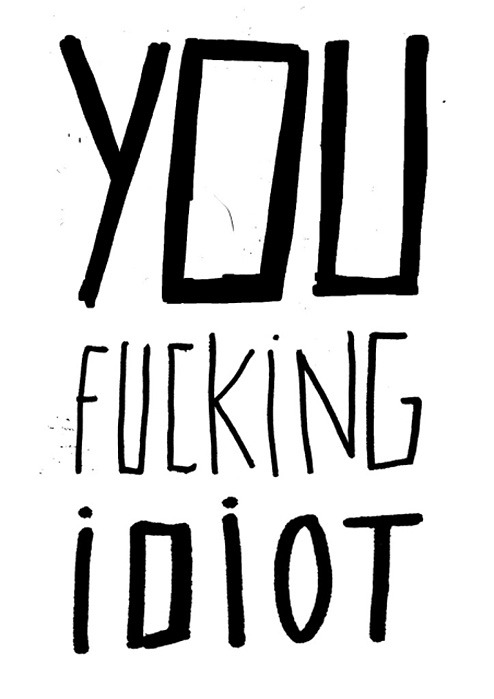
A Giant Fuck

This is a typographics piece I found on 'this isn't happiness' by Rita Gomes which I sort of like but can't explain why exactly.  I have always thought that it would be interesting if you could make a handwriting font for a computer that would generate letters slightly differently at random so as to make it more free-form, like regular handwriting where letters are not uniform.  This made me think of that, then it made me think of me being a fucking idiot...

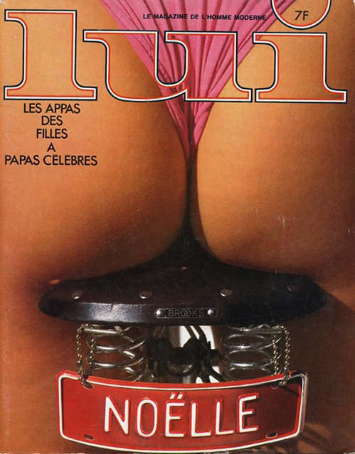
A French Magazine for Him

I'm not too sure why I even posted this let alone how I found it, but here is the cover of the french adult entertainment magazine 'Lui' from the 60's. Sex has been selling quite well ever since it was first tried, but can it be an accredited means of design? It does seem a rather easy job to find someone who looks hot, take off their clothes off and take photos of them so you can hand them out to the public. If it didn't work then so well it would probably be a crime or outdated method of arousal. So if this really is an example of good advertising/graphic design then the grounds for it being so are not as well-rounded as it would appear...

Skin Type

While looking through 'ilovetypography.com' I discovered this really gross typeface by Thijs Verbeek entitled simply 'typeface in skin'.  He uses clothes pegs to pinch various sections of skin into letterforms. Looking through the entire collection I found myself wincing at each image trying to work out where on the body it must be.  For the entire alphabet click here.


Daniel Eatock

Daniel Eatock is still my favourite graphic designer. 

I sat in a lecture of his, as a foundation student doing Graphic Design at Kingston, and marveled at the intellect, wit, and general awesomeness that spilled out of his mouth and circular slide show presentation. He explained the way he works as a freelance graphic designer. It is to set himself rules and guidelines, and then to question them rationally or maybe irrationally. Despite having always thought I would be a fine artist, I had spent the whole year studding Graphic Design (I still wasn't sure why, it had just felt right). But as I sat there mesmerised I finally understood why fine art was so limiting... There were no rules. Without knowing limitations and boundaries, what was there to compete with? What was there to question?  Fine art is art, art can have meaning, art can question anything you want it to question, but it can't ever have the same forethought that Graphic Design has, if it does it's just Graphic Design... call it what you want.

Maybe I have no idea what I'm talking about, maybe i still don't know what I'm talking about but it made sense then.  And I hope it will again some day...


Music Video Project

So there's this band called SaintFalcons who play music, and one day they approached me and said "hey, we need a bassist!" and I was all like, "hey, I play bass guitar" and then a few hours later we were shooting the music video for a song they wrote. The shoot was a group collaboration, with all of us wielding the camera at one point or another, as was costume design... A very special thanks to the special effects crew who were on hand 24/7. 

( Shoot: 2 Mornings / Edit: 1 Day / Location: Richmond Park )


Vivian Chiu

Vivian Chiu is a recent graduate of the Rhode Island School of Design in the Furniture Design department.  An individual that likes to push herself mentally and physically, she believes in the value of hard work, a philosophy that drives many of her designs. Much of her work is a mixture of sculptural and functional, and shows her interest in the materiality of wood.  She draws inspiration from artists such as Martin Puryear, Anish Kapoor, Tom Friedman and Richard Sweeney. 

'Inception Chair'
'Pixel Chair
'Hypercube'


 She also had a nice bunch of photos on her site, the one below particularly caught my eye as a Gerhard Richteresque shot on a trainline. This image applys the same effect Richter uses in his painting method to transform a photo into a mere memory


'TheNortheast'